Debug mode #
Where to find it Plugin settings › Basic › Debug mode
Enables verbose logging for support purposes. Keep disabled on production sites.
A collapsible normally costs you something. Keyboard users cannot reach it, the structured data is missing or duplicated, the colours fight your theme, and the script loads on every page whether you use it or not. Frequently Asked Accordion is one YOOtheme Pro element that does none of that.
Every section below is a live accordion, each one configured differently. Open them.
Minimal Line, Cards, Filled Accent and Frameless. All four read the colour from the YOOtheme customizer through currentColor, so there is no hardcoded hex waiting to clash the day you restyle the site.
The open indicator and the accent line take the colour straight from the YOOtheme customizer, so switching style sheets keeps everything on brand.
Minimal Line is a set of rules with generous spacing. It sits well in an article without shouting.
Accent, heading, content, background and border are real colour pickers with a swatch when you want something specific.
Each header and panel sits in its own surface with a border radius you set yourself.
Cards give a collapsible enough weight to hold its own next to images and grids.
Switch numbering on and the card gets a leading 01, 02, 03.
The open item fills with the accent colour. Good for a step by step where the current step has to be obvious.
Numbering style Badge puts the number in a circle instead of in front of the title.
Switch Multiple Open Items off and opening one closes the rest.
No frames, larger typography and a soft hover tint. Beautiful on landing pages with plenty of whitespace.
The last opened item is stored in the browser and reopened automatically on the next visit.
When printing, all items expand automatically and the controls disappear.
Built to the AA level, not patched towards it afterwards. Try this one with your keyboard only.
Tab reaches the accordion, the arrow keys move between headers, Home jumps to the first and End to the last. Enter and Space open the panel.
Every header is a button with aria-expanded and aria-controls, and every panel points back at its header. No div pretending to be a control.
A visible focus ring on every header, through focus-visible, so mouse users are not bothered by it and keyboard users cannot lose their place.
With prefers-reduced-motion the open animation and the count-up stop. The content still appears, it just does not move.
Text at 4.5:1 and the indicators at 3:1 against their actual background, in both the light and the dark appearance.
Pick the type on the Content tab and the JSON-LD is written for you, in the page language, tied to the page URL. At most one FAQPage per page, so you never end up with two competing blocks when a second accordion joins the layout.
The accordions below carry live How-to and Course markup, and the FAQ at the bottom of this page is the FAQPage. Honest about what that buys you: this makes the page readable for answer engines. Nobody can promise you a rich result.
Upload the zip through Extensions. The plugin enables itself and the element appears in the builder under A YOOzeCase Company.
Choose a style preset, switch numbering on or off and pick the schema type that matches the content.
Add your steps or questions, save the layout, and the structured data is in the page source straight away.
Q&A and FAQ both claim the page itself, and schema.org allows only one of those per URL. The element enforces that for you: whichever comes first in the page wins, the other is left out and the builder tells you why. This page gives that one slot to the FAQ at the bottom, so the Q&A below is shown without its markup. On a real support page you would flip that round.
It is one accordion element that also writes the matching schema.org data for the page.
Presets, colour pickers and the YOOtheme customizer colours keep it on brand without touching CSS.
Full keyboard support, visible focus and correct ARIA come built in.
Upload the zip; the element appears in the builder under A YOOzeCase Company.
Pick a preset, switch on numbering and choose the schema type that fits.
Save the layout and the Course JSON-LD is in the page automatically.
The system plugin decides in a handful of lines whether this request has anything to do with it, and steps aside if not.
Plain JavaScript. Nothing is added to the page that your theme was not already loading.
The stylesheet and the script are queued by the element itself, so a page without an accordion carries neither.
It starts when the accordion scrolls into view, counts, and then stops observing.
Add, reorder or remove items: the numbering always stays correct automatically.
The numbers visibly count up as soon as the accordion scrolls into view. Visitors who prefer reduced motion see the final number right away.
Besides text, every item can hold a complete builder fragment: grids, images, buttons, anything the builder can do.
This one holds plain text, to show both content types side by side.
Sub-items live inside a sublayout and only appear when the main item is opened.
The nested accordion has its own preset, numbering and behaviour, fully independent of the outer one.
You can even nest deeper, although two levels is usually plenty for real content.
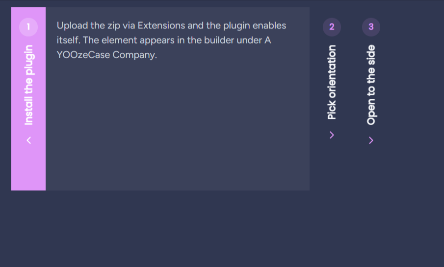
The whole accordion turned a quarter turn: vertical title bars side by side, the open panel slides out to the right. Click the bars below.
Upload the zip through Extensions and the plugin enables itself. The element appears in the builder under A YOOzeCase Company.
Set Orientation to Horizontal on the Style tab. The items turn into side by side bars with vertical titles.
Clicking a bar reveals its panel to the right. On phones it falls back to the normal vertical layout.
Two ways to reveal a panel, one setting. Both stop moving when the visitor asks for reduced motion.
Watch how this panel reveals its content. This is the Expand (down) animation.
Each item uses the same animation. The choice is one setting on the element, under Style.
The left column expands downward; the right column slides its content in from the right. Both respect reduced motion.
Watch how this panel reveals its content. This is the Slide from right animation.
Each item uses the same animation. The choice is one setting on the element, under Style.
The left column expands downward; the right column slides its content in from the right. Both respect reduced motion.
Pick any icon from the YOOtheme library as the open and close indicator.
Drop in a brand icon and it rotates on open just like the built-ins.
Give an item image a width, a height and a focal point, so a portrait and a landscape shot still line up.
A collapsible is often the last thing a visitor reads before deciding. Give the item somewhere to go.
Each item can carry an optional link, shown as a button below the content.
Pick a primary button, a secondary button or a plain text link for the whole accordion.
Accent, heading, content, background and border are colour pickers with a swatch; this accordion uses a custom purple accent.
Set the link style to Text for an underlined link instead of a button.
Every item can override the link text and add its own ARIA label for accessibility.
Point the element at a dynamic source and the items build themselves. The list below is not typed out, it comes from a Joomla category.
Up to 1.6 this element was called A Little Bit Harmonica. Outside the Netherlands that name was not just unknown but misleading, because harmonica means the mouth organ. Version 2.0 renames the product to Frequently Asked Accordion and takes the chance to widen the structured data.
Two search terms instead of one: the FAQ intent and the accordion itself. The element appears in the builder picker as Frequently Asked Accordion, under A YOOzeCase Company.
Mark the questions as speakable so voice assistants know which part of the page is worth reading aloud.
A Q&A block can now name who answered and how many people found it useful, on the question and on each answer.
A how-to can state how long it takes and what you need before you start.
Give an item its own anchor and you can link a visitor straight to that one question from anywhere.
And this is the FAQ itself: the same element, with FAQ schema switched on, live search, a count badge and deep links. One FAQPage for this page, nothing duplicated.
No items match your search.
An accordion element for the YOOtheme Pro builder with style presets, schema.org structured data, automatic numbering and live search. Built by A YOOzeCase Company.
Pick the FAQ schema type on the Content tab. Every question and answer is added to the page as JSON-LD automatically, with at most one FAQ block per page.
No, and nobody can promise that: FAQ markup no longer produces rich results for most sites. What it does is make the page structure readable for search and answer engines.
Yes. With deep links every item gets its own anchor. Opening such a link expands the right item and smoothly scrolls it into view.
Fully. Arrow keys, Home and End move between the headers, and every panel carries the proper ARIA attributes for screen readers.
Joomla 5 and 6, and WordPress 6 and 7, from one shared core. YOOtheme Pro on either platform.
It became this. Version 2.0 is the same element under a name that works outside the Netherlands as well.
No settings match your search.
This manual documents Frequently Asked Accordion YOOtheme Pro, version 2.0.2.
Accordion element for the YOOtheme Pro builder with style presets, schema.org (FAQ, How-to, Q&A, Course), optional numbering, deep links, live search and full accessibility.
upgrading. Version 2.0.0 renamed the builder elements from yc_harmonica to yc_frequently_asked_accordion, and an element type the builder does not know is skipped silently: the accordion disappeared from the page, taking its schema markup with it, without a warning anywhere. This release registers the old names again as hidden aliases, so layouts saved under "A Little Bit Harmonica" render exactly as they did before. Nothing to migrate, nothing to click.
@extend key is now resolved on WordPress as well, so both platforms build an elementdefinition the same way. The aliases carry no copy of the definition: they are three lines pointing at the real element, which means a field added to the element can never go missing from the alias.
mechanism the item element already used, so the picker still lists one entry.
Pro's own Accordion element: two entries with the same name, and searching for "accordion" in the picker returned both. It now reads Frequently Asked Accordion.
Tot en met 1.6.0 heette het A Little Bit Harmonica. De oude naam was buiten Nederland niet alleen onbekend maar misleidend: "harmonica" betekent internationaal mondharmonica.
plg_system_yc_harmonica naar plg_system_yc_frequently_asked_accordion.yc_frequently_asked_accordion en yc_frequently_asked_accordion_item.Breaking change: bestaande builder-layouts met het oude element renderen niet meer en moeten omgezet worden.
groepskop "A YOOzeCase Company".
YOOzeCase\FrequentlyAskedAccordion, veld-namespace naar YOOzeCase\Plugin\System\FrequentlyAskedAccordion\Field.
PLG_SYSTEM_YC_FREQUENTLY_ASKED_ACCORDION_* in alle zes basistalen(43 sleutels, pariteit geverifieerd).
yc-frequently-asked-accordion; alle .po/.mo/.pot opnieuwgegenereerd uit de Joomla-ini's.
yc-accordion-, JS-global naar ycAccordion. Bewust kort: deze staanalleen in gerenderde output, niet in klantlayouts, en de volledige merknaam zou de stylesheet ongeveer verdubbelen.
updates.yoozecase.com/frequently-asked-accordion/; gateway-product-sleutel naar yc_frequently_asked_accordion (moet in de gateway PRODUCT_MAP staan voor activatie werkt).
door het document loopt. Er waren geen klanten die de oude naam kenden.
Geen. Er is geen logica gewijzigd, alleen identiteit.
Nieuwe install; het install-script zet de oude plugin uit. Plugin-instellingen worden niet meegenomen en moeten opnieuw gezet worden. Builder-layouts met het oude element moeten om.
Vanaf deze release delen Joomla en WordPress één versielijn. Wat in 1.6.0 zit, zit in beide.
Het paneel klapt open via een CSS-transitie op grid-template-rows, van 0fr naar 1fr. In de bouwer-preview loopt die transitie niet door, waardoor de berekende waarde op 0px blijft staan en het item weigert te openen. Op de site zelf gebeurt dit niet, en zodra een transitie één keer is afgerond werkt het in de bouwer daarna ook. Dat verklaart het grillige beeld.
Gemeten in de bouwer op productiewebsite.nl op 2026-08-06. De JavaScript deed gewoon zijn werk: na een klik stond aria-expanded op true en had het item de klasse yc-open. Alleen de hoogte bleef nul. Het beslissende bewijs: transition: none forceren liet hetzelfde paneel meteen naar zijn inhoudshoogte van 42px springen.
De animatie wordt nu uitgezet in de preview via de klasse yc-accordion--no-anim. In een bewerkomgeving heb je die animatie niet nodig; het item opent daar direct.
Platform::isPreview() leunde op de customizer-vlag van YOOtheme. Gemeten in dezelfde sessie: in de bouwer op WordPress kwam die vlag niet als waar terug, waardoor niets dat ervan afhing werd uitgevoerd, ook het data-preview="reload"-attribuut niet. WordPress heeft een eigen antwoord op dezelfde vraag en de bouwer draait in de WP-customizer, dus is_customize_preview() is daar de betrouwbare test. De YOOtheme-vlag blijft als terugval staan.
Pad A, meedoen in de schema-graph van de SEO-plugin via wpseo_schema_graph_pieces of rank_math/json_ld, is nog niet gebouwd. Met een SEO-plugin actief levert de plugin een eigen JSON-LD-blok naast de graph, met een correcte isPartOf-koppeling. Dat werkt en is gemeten, maar het graph-pad is het nettere ontwerp en staat voor de volgende release.
Het schema is voor het eerst live op WordPress gemeten, naast Yoast. Eén FAQPage per URL, een eigen @id, en isPartOf die exact het @id van het WebPage-knooppunt van Yoast oppakt. Nul achtergebleven markers. Hetzelfde gedrag als op Joomla.
Geen. Geen databasewijziging, geen gewijzigde parameters.
Licentiefix en gedeelde kern. Geen functionele wijziging aan het element zelf.
license/YcLicense.php bouwde de gateway-URL als https://updates.yoozecase.com/license/activate. Die extensieloze vorm geeft op deze host een 403; alleen index.php?action= werkt. Gemeten op 2026-08-05: POST op de oude vorm gaf 403 met een HTML-foutpagina, POST op de juiste vorm gaf 200 met {"ok":false,"error":"invalid_key"}. Er is dus nooit een activatie via deze plugin geslaagd.
Tweede fout in hetzelfde bestand: de drempel $code >= 500 liet die 403 door als een oordeel. De respons werd als bad_response opgeslagen in license_status, waarna de klant een dode licentie-UI zag terwijl er met zijn sleutel niets aan de hand was.
De client is vervangen door de drop-in uit de skill yoozecase-license-gateway, met alleen PRODUCT, ELEMENT en de namespace aangepast. Alles behalve HTTP 200 met parseerbare JSON en een ok-sleutel geldt nu als transportfout: de laatst bekende status blijft staan en de grace-periode van zeven dagen doet zijn werk.
Klanten met een foutstatus: die verdwijnt vanzelf bij de eerstvolgende geslaagde validatie. Zonodig een keer deactiveren en opnieuw activeren.
Alle CMS-aanroepen lopen nu via modules/frequently_asked_accordion/Platform.php, een adapter met zeven methoden (text, transliterate, rootPath, siteLang, pageUrl, assets, version). Daardoor zijn helpers.php, de element.json-definities, de transforms en de templates byte-identiek aan het WordPress-pakket.
Helper::VERSION is vervangen door Helper::version(), die de pakketversie per platform oplost. Een gedeeld bestand kan geen constante dragen die op twee platforms verschillend moet zijn.
Vijf sleutels toegevoegd in alle zes basistalen: LIC_HIDE, LIC_LAST_CHECKED, LIC_ERR_WRONG_PRODUCT, LIC_ERR_FORBIDDEN, LIC_ERR_INVALID_TOKEN. Pariteit 43 van 43.
Positief. Een transportfout wordt niet langer als licentie-oordeel opgeslagen, en de gateway-URL is nu de vorm die daadwerkelijk antwoordt.
Geen databasewijziging. De vijf licentie-params blijven ongewijzigd.
All notable changes to this project are documented in this file. Format: Keep a Changelog. Versioning: SemVer (three segments, no v-prefix).
Where to find it Plugin settings › Basic › Debug mode
Enables verbose logging for support purposes. Keep disabled on production sites.
radioNo
10Where to find it Plugin settings › License › License key
Enter your A YOOzeCase Company license key and activate it for this site. The element keeps working if activation is unavailable; only updates require an active key.
ycfrequentlyaskedaccordionlicenseWhere to find it YOOtheme builder › Frequently Asked Accordion › Content › Items
This setting has no help text in the plugin.
content-itemsWhere to find it YOOtheme builder › Frequently Asked Accordion › Content › Schema.org Type
Adds JSON-LD structured data. FAQ: each item becomes a Question. How-to: each item becomes a step (with optional time, supplies and tools). Q&A: one question with the items as answers. Course: the items become syllabus sections. Make sure the visible content matches the schema. The markup helps AI answer engines, voice and non-Google search; note that Google no longer shows FAQ rich results (since May 2026) or How-to rich results (since 2023), so do not expect a Google snippet from those.
selectNone
nonefaqhowtoqapagecourseWhere to find it YOOtheme builder › Frequently Asked Accordion › Content › How-to Name
Required for the HowTo schema: the name of the task being explained.
textWhere to find it YOOtheme builder › Frequently Asked Accordion › Content › Q&A Question
The single question this page answers. The items become its answers; the first item is the accepted answer. Note: Google intends QAPage for community pages where visitors post answers; for editorial FAQ use the FAQ type instead.
textWhere to find it YOOtheme builder › Frequently Asked Accordion › Content › How-to Total Time
Optional ISO 8601 duration, e.g. PT30M (30 min) or PT1H30M.
textWhere to find it YOOtheme builder › Frequently Asked Accordion › Content › How-to Supplies
Optional materials, one per line. Added as HowToSupply.
textareaWhere to find it YOOtheme builder › Frequently Asked Accordion › Content › How-to Tools
Optional tools, one per line. Added as HowToTool.
textareaWhere to find it YOOtheme builder › Frequently Asked Accordion › Content › Course Name
Required for the Course schema.
textWhere to find it YOOtheme builder › Frequently Asked Accordion › Content › Course Description
Required for the Course schema: a short description of the course.
textareaWhere to find it YOOtheme builder › Frequently Asked Accordion › Content › Course Provider
Required for the Course schema: the organisation that offers the course.
textWhere to find it YOOtheme builder › Frequently Asked Accordion › Content › Speakable (voice / AEO)
Marks the titles and answers as speakable so voice assistants and AI engines can read them aloud. Adds a SpeakableSpecification to the FAQ or How-to schema.
checkboxWhere to find it YOOtheme builder › Frequently Asked Accordion › Content › Last Modified Date
Optional. Adds a dateModified to the schema so answer engines see how fresh the content is. Enter a date (e.g. 2026-06-19) or bind it to a dynamic source such as an article's Modified date. Added to FAQ, How-to, Q&A and Course.
textWhere to find it YOOtheme builder › Frequently Asked Accordion › Content › Question Author
Optional. Name of the person who asked the question. Google lists author as a recommended field for Q&A content.
textWhere to find it YOOtheme builder › Frequently Asked Accordion › Content › Question Upvotes
Optional. Number of upvotes the question received. Left empty when your site has no voting.
numberWhere to find it YOOtheme builder › Frequently Asked Accordion › Style › Appearance
Light forces white panels with dark text, Dark forces light text with translucent panels. Auto inherits the surrounding theme colors.
selectautolightdarkWhere to find it YOOtheme builder › Frequently Asked Accordion › Style › Style Preset
Minimal Line: thin dividers. Cards: shadowed cards. Filled Accent: open header fills with the accent color. Frameless: no borders, larger typography.
selectMinimal Line
linecardsfilledsoftWhere to find it YOOtheme builder › Frequently Asked Accordion › Style › Toggle Icon
Chevron rotates 180 degrees, Plus morphs into a minus, YOOtheme icon lets you pick any icon from the YOOtheme library, Custom SVG uses an uploaded icon. All rotate on open except Plus.
selectChevron (rotate)
chevronplusyoocustomnoneWhere to find it YOOtheme builder › Frequently Asked Accordion › Style › Orientation
Vertical: the classic top-to-bottom accordion. Horizontal: items become side-by-side bars with vertical titles, and the open panel reveals to the right. Horizontal falls back to vertical on small screens.
selectVertical
verticalhorizontalWhere to find it YOOtheme builder › Frequently Asked Accordion › Style › Open Animation
Expand: the panel grows (downward when vertical, to the right when horizontal). Slide from right: the content also slides in while the panel opens. Both respect reduced-motion settings.
selectExpand
expandslideWhere to find it YOOtheme builder › Frequently Asked Accordion › Style › Icon Position
This setting has no help text in the plugin.
selectRight
rightleftWhere to find it YOOtheme builder › Frequently Asked Accordion › Style › Title Element
HTML element for the item titles. Pick a heading level that fits the page outline.
selecth3
Where to find it YOOtheme builder › Frequently Asked Accordion › Style › YOOtheme Icon
Pick an icon from the YOOtheme library to use as the open/close indicator.
iconWhere to find it YOOtheme builder › Frequently Asked Accordion › Style › Custom Icon (SVG)
Upload an SVG to use as the open/close indicator. It rotates on open.
imageWhere to find it YOOtheme builder › Frequently Asked Accordion › Multiple Open Items
Allow more than one item to be open at the same time.
checkboxWhere to find it YOOtheme builder › Frequently Asked Accordion › Collapsible
Allow closing the open item so all items can be closed.
checkbox1
Where to find it YOOtheme builder › Frequently Asked Accordion › First Item Open
Open the first item on page load.
checkboxWhere to find it YOOtheme builder › Frequently Asked Accordion › Deep Link Items
Each item gets its own #anchor. Opening such a link expands the item; toggling an item updates the URL.
checkboxWhere to find it YOOtheme builder › Frequently Asked Accordion › Scroll to Opened Item
Smoothly scroll the opened item into view.
checkboxWhere to find it YOOtheme builder › Frequently Asked Accordion › Scroll Offset (px)
Offset in pixels for sticky headers, e.g. 80.
textWhere to find it YOOtheme builder › Frequently Asked Accordion › Remember Open Items
Store the open items in the visitor's browser (localStorage) and restore them on the next visit.
checkboxWhere to find it YOOtheme builder › Frequently Asked Accordion › Search Field
Live search field above the accordion that filters items by title and content.
checkboxWhere to find it YOOtheme builder › Frequently Asked Accordion › Search Placeholder
This setting has no help text in the plugin.
textWhere to find it YOOtheme builder › Frequently Asked Accordion › Expand/Collapse All Button
Button above the accordion that opens or closes all items at once.
checkboxWhere to find it YOOtheme builder › Frequently Asked Accordion › Numbering
Automatically number the items. Numbers update when items are added, removed or reordered.
checkboxWhere to find it YOOtheme builder › Frequently Asked Accordion › Numbering Style
This setting has no help text in the plugin.
selectPadded (01, 02, 03)
plainpaddedbadgeWhere to find it YOOtheme builder › Frequently Asked Accordion › Count-up Animation
Numbers count up when the accordion scrolls into view. Disabled automatically for visitors who prefer reduced motion.
checkboxWhere to find it YOOtheme builder › Frequently Asked Accordion › Item Count Badge
Badge above the accordion showing the number of items.
checkboxWhere to find it YOOtheme builder › Frequently Asked Accordion › Badge Text
Use {n} as placeholder for the number, e.g. '{n} questions'.
text{n}
Where to find it YOOtheme builder › Frequently Asked Accordion › Badge Text (Singular)
Text when exactly one item is shown, e.g. '{n} question'. Leave empty to reuse the badge text.
textWhere to find it YOOtheme builder › Frequently Asked Accordion › Link Text (default)
Default text for the call-to-action link on items that have one. Each item can override it. Leave empty to use the built-in 'Read more' (translated).
textWhere to find it YOOtheme builder › Frequently Asked Accordion › Link Style
How the call-to-action link is shown: a primary button, a secondary button or a plain text link.
selectButton (primary)
primarydefaulttextWhere to find it YOOtheme builder › Frequently Asked Accordion › Accent Color
Overrides the accent (the built-in accent is used when left empty), e.g. #1e62d0.
colorWhere to find it YOOtheme builder › Frequently Asked Accordion › Heading Text Color
This setting has no help text in the plugin.
colorWhere to find it YOOtheme builder › Frequently Asked Accordion › Heading Background
This setting has no help text in the plugin.
colorWhere to find it YOOtheme builder › Frequently Asked Accordion › Content Text Color
This setting has no help text in the plugin.
colorWhere to find it YOOtheme builder › Frequently Asked Accordion › Content Background
This setting has no help text in the plugin.
colorWhere to find it YOOtheme builder › Frequently Asked Accordion › Border Color
This setting has no help text in the plugin.
colorWhere to find it YOOtheme builder › Frequently Asked Accordion › Border Radius (px)
This setting has no help text in the plugin.
textWhere to find it YOOtheme builder › Frequently Asked Accordion › css
Enter your own custom CSS. The following selectors will be prefixed automatically for this element: <code>.yc-accordion__item</code>, <code>.yc-accordion__toggle</code>, <code>.yc-accordion__title</code>, <code>.yc-accordion__content</code>
editorWhere to find it YOOtheme builder › Item › Content › Title
This setting has no help text in the plugin.
textWhere to find it YOOtheme builder › Item › Content › Content Type
This setting has no help text in the plugin.
selecttextlayoutWhere to find it YOOtheme builder › Item › Content › Content
This setting has no help text in the plugin.
editorWhere to find it YOOtheme builder › Item › Content › Schema Text
Plain-text answer used in the schema.org data when the content is a sublayout. Leave empty to exclude this item from the schema.
textareaWhere to find it YOOtheme builder › Item › Content › Image
Optional image shown above the item content.
imageWhere to find it YOOtheme builder › Item › Content › Image Alt
This setting has no help text in the plugin.
textWhere to find it YOOtheme builder › Item › Content › Image Width
Setting just one of width/height keeps the original proportions. The image is resized and cropped server-side, with high-resolution versions auto-generated where possible.
numberWhere to find it YOOtheme builder › Item › Content › Image Height
This setting has no help text in the plugin.
numberWhere to find it YOOtheme builder › Item › Content › Image Focal Point
Controls how the image is cropped when both width and height are set.
selecttop-lefttop-centertop-rightcenter-leftcenter-rightbottom-leftbottom-centerbottom-rightWhere to find it YOOtheme builder › Item › Content › Link
Optional call-to-action link shown below the item content, e.g. a link to the full article.
linkWhere to find it YOOtheme builder › Item › Content › Link Text
Overrides the element-wide link text for this item. Leave empty to use the element default.
textWhere to find it YOOtheme builder › Item › Content › Link ARIA Label
Accessible label for the link when the visible text is not descriptive enough on its own.
textWhere to find it YOOtheme builder › Item › Settings › Anchor
Custom #anchor for deep linking. Leave empty to generate one from the title.
textWhere to find it YOOtheme builder › Item › Settings › Initially Open
Open this item on page load.
checkboxWhere to find it YOOtheme builder › Item › Settings › Answer Author
Optional, Q&A Page schema only. Name of the person who wrote this answer.
textWhere to find it YOOtheme builder › Item › Settings › Answer Upvotes
Optional, Q&A Page schema only. Number of upvotes this answer received.
numberWhere to find it YOOtheme builder › Item › sublayout
This setting has no help text in the plugin.
builder-fragmentWe use cookies and similar technologies to improve your experience on our website. Read our Privacy Policy.